
How will Climate Change affect the future?
The IPCC sixth assessment report [1] provides a range of future scenarios for climate change depending upon the emissions trajectory that humanity embarks upon.
For example, humanity may not take any action at all, in which case the trajectory of future emissions of greenhouse gasses will be one that continues to rise. On the other hand, humanity may wake up and take drastic action, in which case the future trajectory for emissions of greenhouse gasses will show a sharp decline.
There are many other potential trajectories for emissions of greenhouse gasses, and for each one the IPCC has used the latest science to model what the impact on the global climate will be up until 2100.
Temperature Increases
The IPCC uses five different emission trajectories. The ideal one is where emissions decline to zero up until 2050, at which point there are no more emissions of greenhouse gasses. This is the light blue curve in the graph below, which shows global temperatures stabilising just below the critical threshold of 1.5C by 2100. Most importantly however is the fact that the trend for global temperatures is now downward, indicating that the crisis has been averted and global temperatures are now falling.


You can also see from the graph the low-likelihood, high-impact trajectory, which represents a faster rate of collapse in the Greenland and Antarctic ice sheets. In this scenario sea levels rise at a much faster rate, and by 2100 they have risen by between 1.5 and 2m. Worse, the rate of sea level rise is continuing at a very fast pace and is no longer possible to stop.
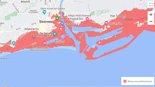
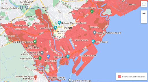
It's one thing to understand that sea levels are likely to rise by nearly a metre by 2100, and another thing to know what this actually means for the world. The two images below show what the coast around Swansea and Cardiff after a 0.5m rise in sea levels [2]. All of the areas shown in red are now below the annual flood level, with direct access to the sea, meaning that they are likely to be subject to more regular flooding events.
One important consequence of all this that is often overlooked is that all of the world's beaches will have gone under the water. All the famous beaches in the Gower, for example, or Swansea bay beach, will be underneath the sea. It is also worth bearing in mind when looking at this map that although it shows extensive flooding, Swansea and Cardiff are both far less affected than other parts of the UK. Lastly, it is worth reminding yourself that children born today will be experiencing this future.
The map of the UK and the rest of the world will be radically transformed by a sea level rise of 0.5m, which is the very least amount of sea level rise we can expect in the IPCC scenarios. Across the world, some 40% of the global human population live near to the coast.
The next emissions trajectory, and perhaps the most likely one, is where emissions decline to zero by around 2075, at which point there are no more emissions of greenhouse gasses. This is the dark blue curve in the graph, which shows global temperatures stabilising between 1.5 and 2C. Although we have overshot the critical 1.5C threshold, it is not by much, and most critically the global temperature by 2100 is now on a downward trend, which shows that, like with the blue line, that the crisis has been averted and global temperatures are now falling.
The next three emission trajectories show what happens if we continue emitting greenhouse gasses, either in medium (orange line), high (pink line) or very high (red line) amounts. In these scenarios global temperatures reach between 2.5 and 5C by the year 2100. Worse, the trend is for global temperatures to continue increasing beyond 2100.
The Distribution of Future Global Warming
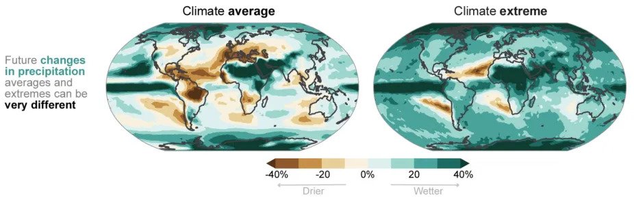
Global warming represents an increasing average temperature for the world, but not all regions will experience the same levels of warming. Because we are dealing with an average, some parts will warm more than others.
The first graph below, called climate average, shows how the increase in global temperature will be distributed across the world. The redder the region, the more hotter it will become. The graph shows clearly how the greatest amount of warming will occur in the polar regions, affecting the ice caps with temperature increases of up to 8C, a truly staggering amount. It also shows, for example, the higher levels of heating that occur in the Siberian permafrost, or in the Amazon rainforest.

Rising Sea Levels
The melting of the Greenland and Antarctic ice caps, along with the rising temperature of the oceans due to global warming, are all factors which are causing global sea levels to rise. Sea levels have already risen by around 20cm over the last century, and are expected to rise by a foot by 2050, regardless of what we do to reduce greenhouse gas emissions, due to levels of greenhouse gasses already in the atmosphere.
There is a great deal of uncertainty however in future projections of sea level rise due to the fact that not much is known about the rate at which the Greenland and Antarctic ice caps will melt. For this reason, when giving projections for future sea level rise, the IPCC also give what they call a 'low-likelihood, high-impact' projection. This scenario represents a more drastic rate of collapse of the Greenland and Antarctic ice sheets leading to a higher level of sea level rise which, although considered unlikely, carries enough risks associated with it that it is important to model.
The graph below shows the IPCC projections for sea level rise up to 2100. The coloured lines give the different emissions scenarios that were discussed previously. In the low emission scenarios sea level rises by about half a metre by 2100, whereas in the higher emissions categories global sea level rises by nearly a metre by 2100.
The second graph, called climate extreme, shows how heat waves will be distributed, with the redder areas showing more extreme heat waves. Places like Greenland show very little heatwaves, but places like the Amazon or the Arctic show very severe, extreme heatwaves.
Together the graphs show how vulnerable the polar regions, Siberia, and the Amazon are, and that in any future scenario of global warming these regions are going to be where the first tipping points are likely to be reached, and where runaway global warming is initiated.
Future Changes in Rainfall
Climate models indicate that climate change will intensify the earth's water cycle, increasing the frequency and intensity of storms and floods, and that it will also contribute to increased drying out in some places, which will lead to a higher likelihood of droughts.
The climate average graph below shows how changes in rain and snowfall will be distributed across the globe. You can see that the UK and Europe will become a lot drier, and see a lot less rainfall, and especially the Mediterranean region, which will see 40% less rainfall. On the other hand, the Sahara desert, the Arabian peninsula, and southern asia will see a 40% increase in rainfall.
The climate extreme graph on the other hand shows how extreme rain and snowfall events will be distributed across the globe. It shows that even though the UK will see an average 20 to 30% less rainfall, it will see a corresponding increase in the number of extreme rainfall events, leading to more flooding. In fact, the graph shows that all regions of land across the globe will see a marked increase in the number of extreme rainfall events, leading to more floods.